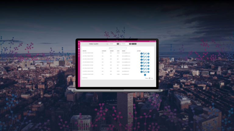
Graphus UI gets a makeover!

Our team has been working hard to constantly improve the Graphus® product and our latest release is another example of their excellent work!
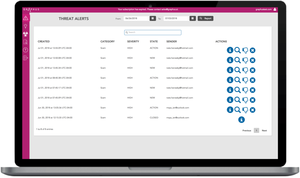
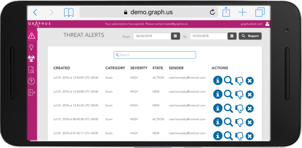
We are excited to announce that on July 4th, we had a new product release. This release focused primarily on the user interface and mobile compatibility. The new UI is cleaner and better represents the Graphus brand. We did not change anything from a workflow or process standpoint so it will continue to be just as easy to navigate the product, investigate alerts, and take appropriate actions.
A few of the major changes include:
Updated look and feel that represents the Graphus colors.

Updated charts and graphs on the Insights screen.
New Details and Investigate icons.

Graphus now works on your mobile devices!

Interested in learning more? View a recording of our product clicking on the button below.


